2021 · UX/UI Project
ASF — Regulatory Data Platform
Making complex information easier to navigate and understand.
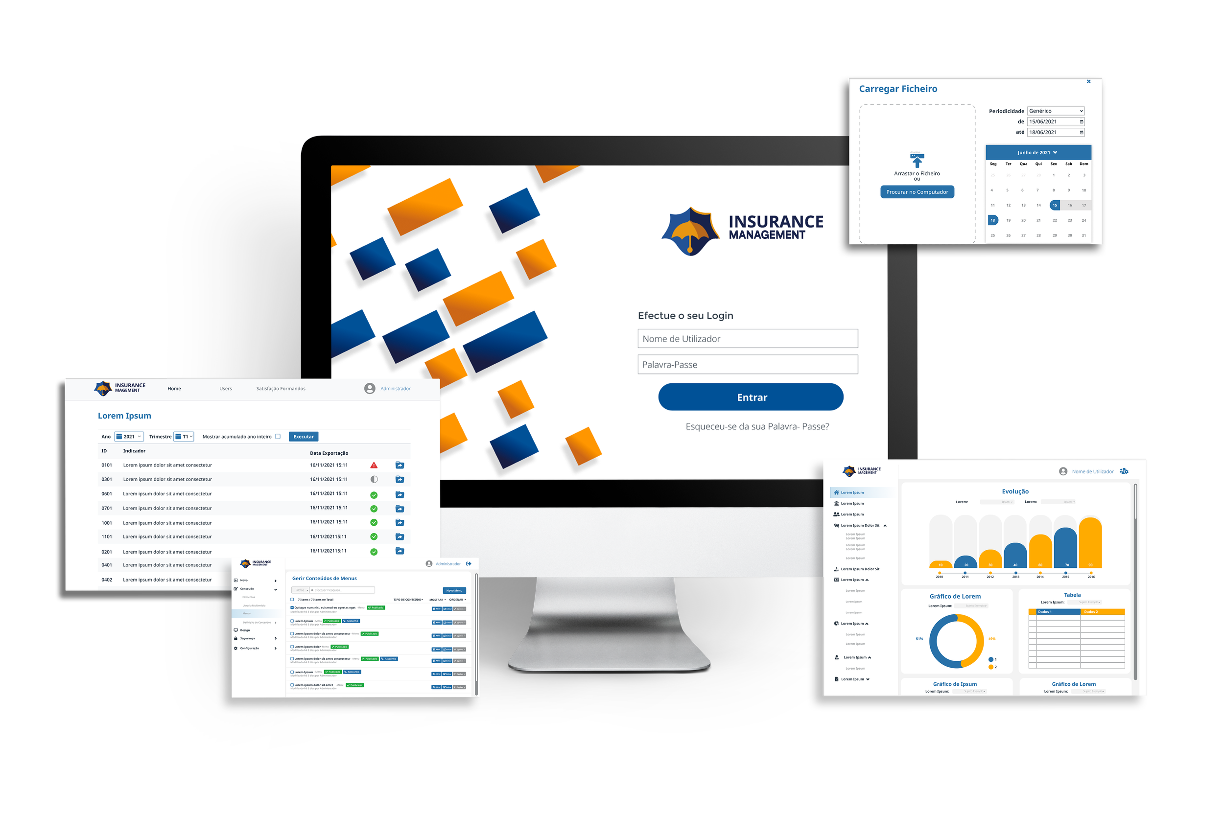
A UX/UI concept exploring how document management, regulatory information and data visualisation could work together in a single desktop platform.
- Client
- ASF — Insurance and Pension Funds Supervisory Authority
- Company
- Reditus
- Role
- UX/UI Designer
- Platform
- Desktop Web Application
- Focus
- Enterprise UX · Information Architecture · Data Visualisation
- Status
- Concept proposal (not implemented)
The Challenge
Bringing complex data into one experience.
The brief was to explore a platform that could organise regulatory documents and transform their information into accessible reports and visualisations.
The UX challenge was to balance information density with clarity, making complex data easier to find, navigate and interpret.
My Design Approach
Structure before screens
I explored a consistent navigation system that grouped information into clear categories, helping users move between documents, supervision areas and reports.
Different users, connected workflows
The proposed experience separated everyday tasks, such as uploading, classifying and consulting documents, from administrative work involving record management and reporting.
Make data understandable
I explored dashboards combining charts, tables and filters, allowing users to scan trends quickly while retaining access to more detailed information.
Outcome & Reflection
A design proposal focused on clarity.
I developed a UX/UI concept for organising documents and reporting, with clearer navigation and access to detailed data.
The proposal was not approved for implementation, so there are no production results or measured usability improvements to report.
Key takeaway: Enterprise design is not simply about removing information. It is about making detailed information easier to navigate and understand.